YEAR
YEAR
YEAR
Fall 2020 - Fall 2021
Spring 2019
Spring 2021
DELIVERABLES
DELIVERABLES
DELIVERABLES
Visual Direction
Brand Guidelines
Brand Launch
Photography
Juried Exhibition
Workshops
Lecture Series
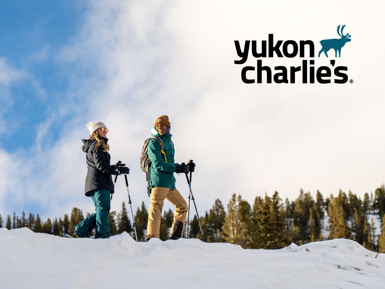
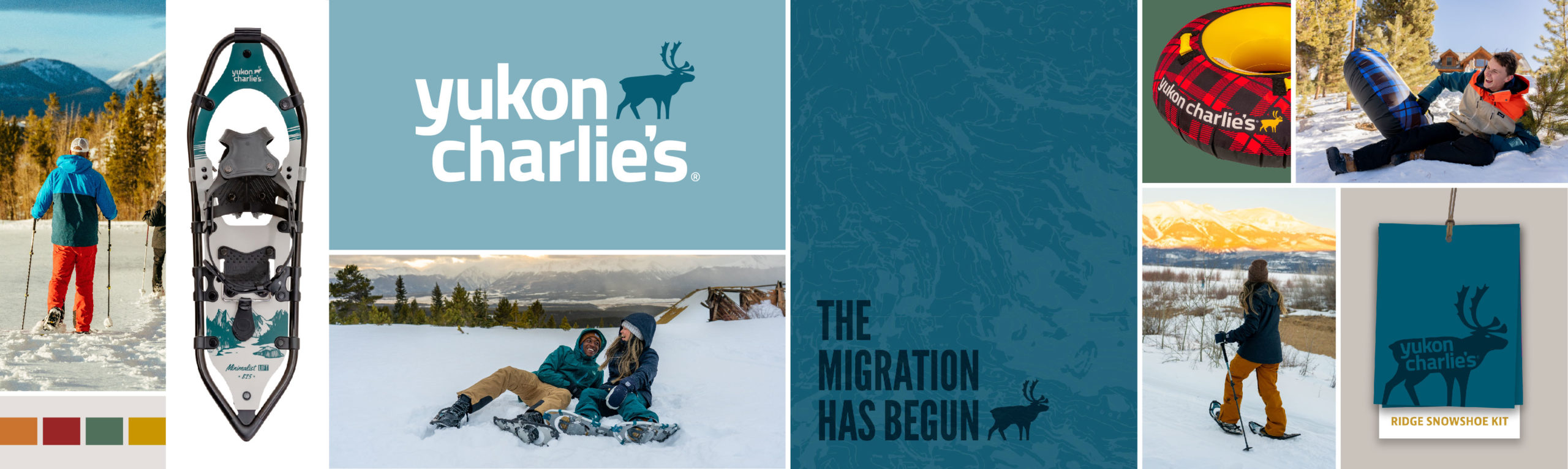
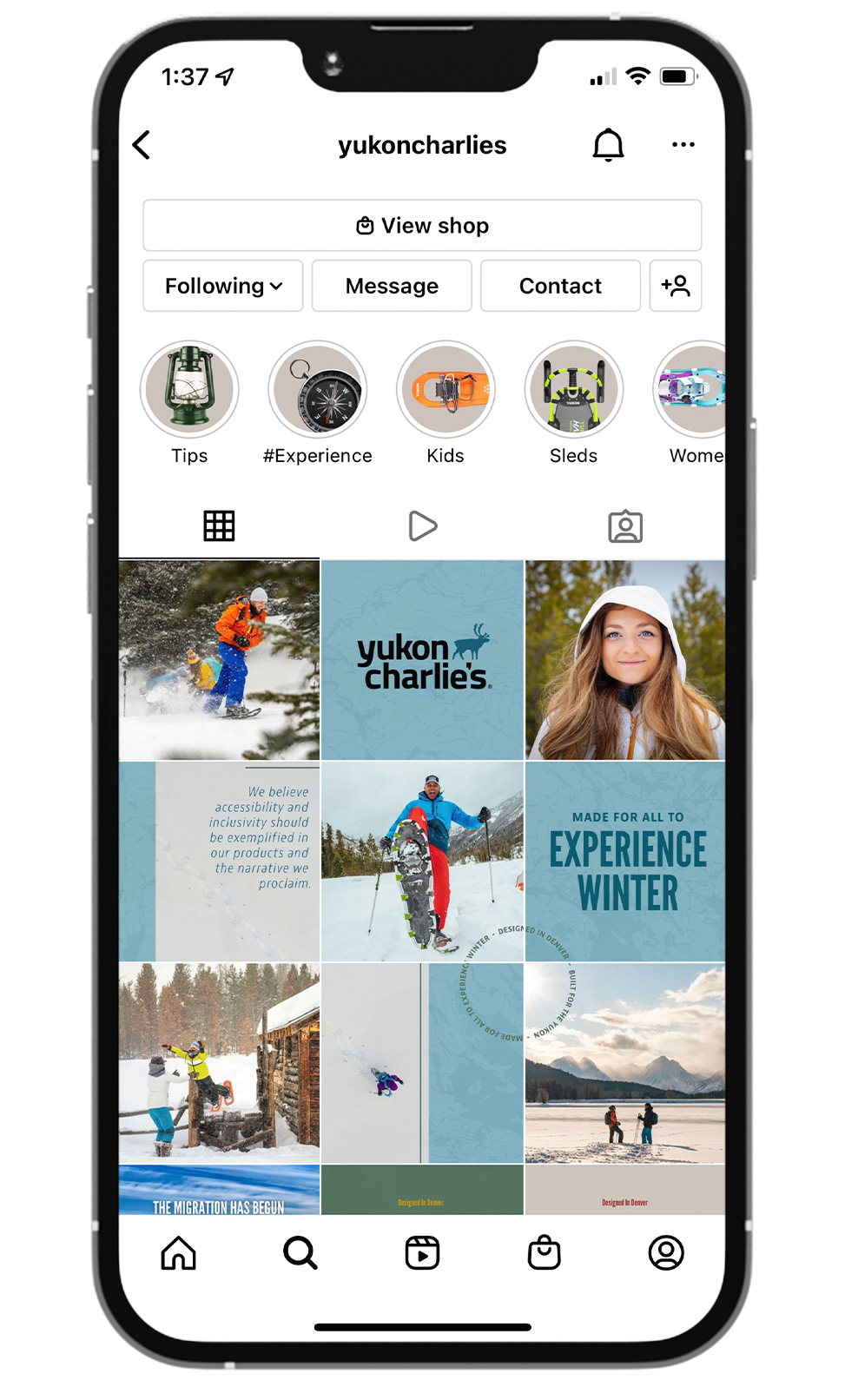
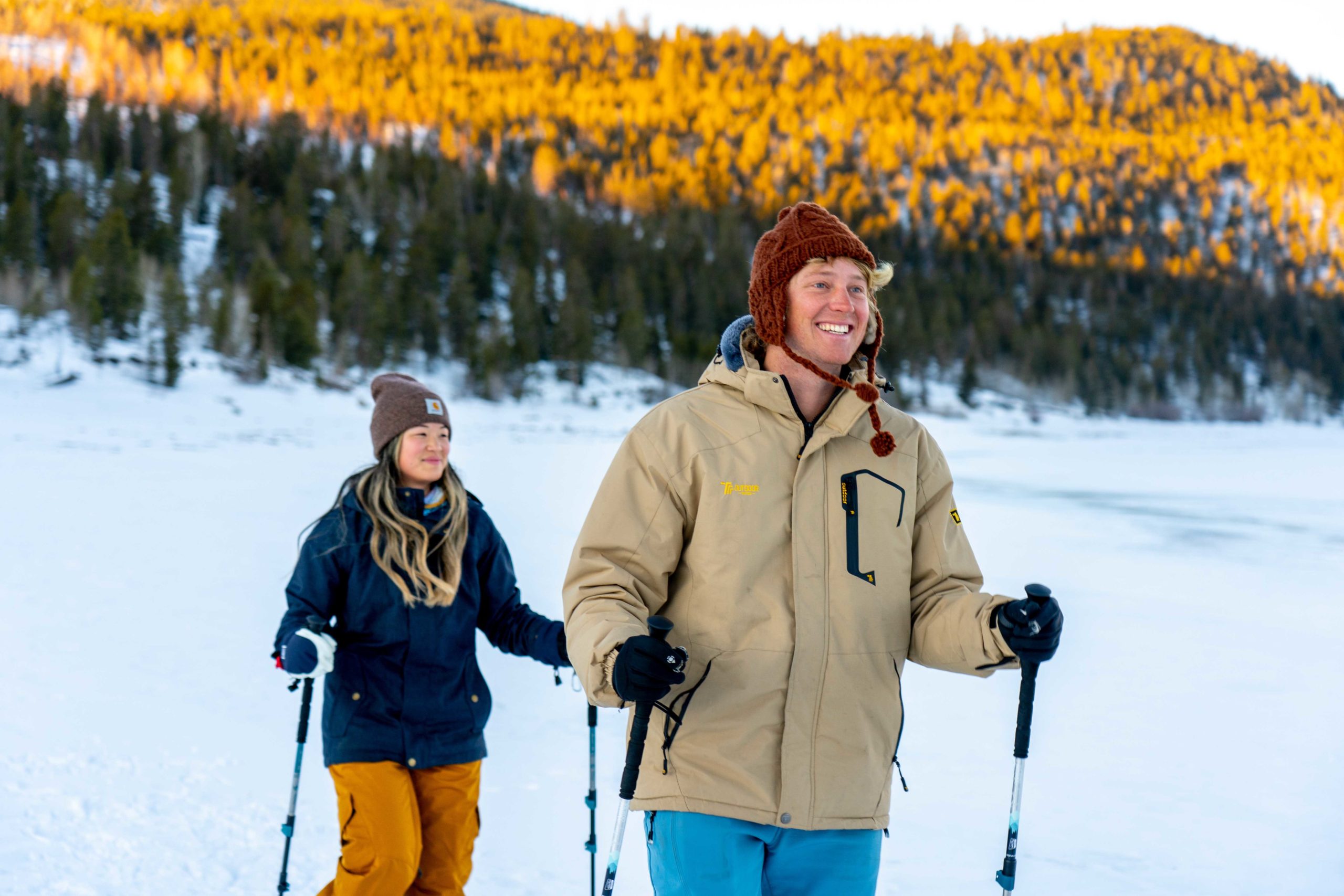
A Breath of Fresh Air Into the Yukon Charlie's Brand
Yukon Charlie's is a winter outdoor sporting goods brand that primarily sells snowshoes. I had the opportunity to spearhead the Yukon Charlie’s rebrand, conceptualizing and building the visual identity, brand positioning, brand guidelines, packaging, and displays. I presented and led the discussion on each element of the rebrand to a core stakeholder group, leading a positive discussion and decision-making process along the way.
THE PROBLEM
Lack of clarity around "who we are" and "who we want to be"
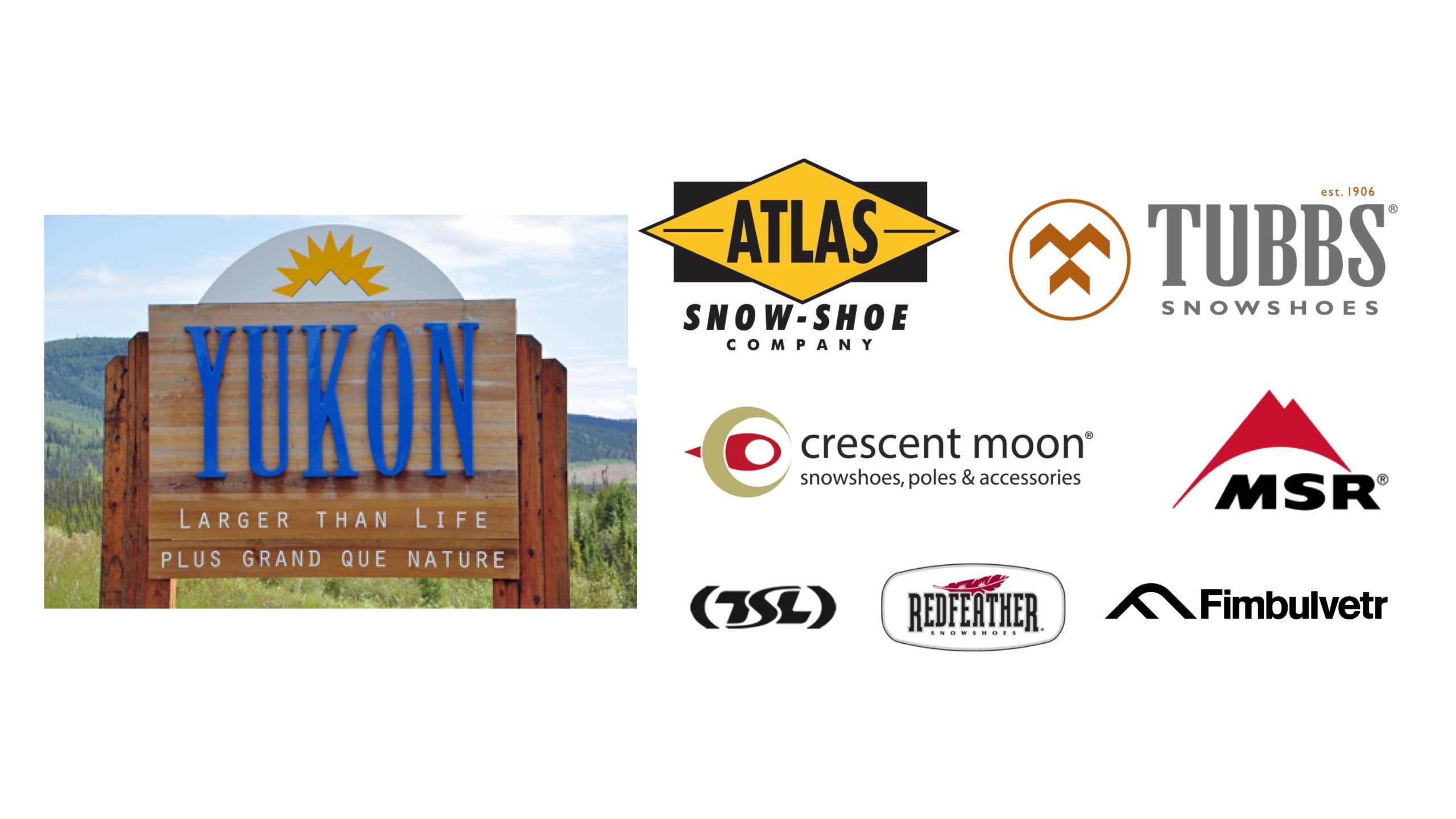
Yukon Charlie's was purchased by Airhead Sports Group in 2016. Since the acquisition, the brand name had altered back and forth between Yukon Charlie's and Yukon, the niche in the market for products was vauge to employees and consumers, and there was a lack of consistency across marketing, product, and sales channels.
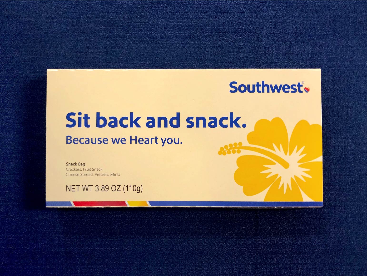
LUVLines is Southwest's monthly internal publication distributed to communicate company-wide news, highlight accomplishments, and share event photos and encouraging stories. LUVLines reaches over 50,000 employees. I designed spreads for the June, July, and August articles.
THE PROCESS + STRATEGY
Phase 1: Discovery and Research
- Positioning Survey: Brand Ambassadors, Employees, Followers
- Competitive analysis within the snowshoe industry
LUVLines is Southwest's monthly internal publication distributed to communicate company-wide news, highlight accomplishments, and share event photos and encouraging stories. LUVLines reaches over 50,000 employees. I designed spreads for the June, July, and August articles.
Phase 2: Write and Develop
- Create a set of core values that defines the brand and guides the rest of the project.
- Core values are influenced by company history, internal and external survey feedback, competitive analysis, feedback from key buyers, and success from previous photoshoots.
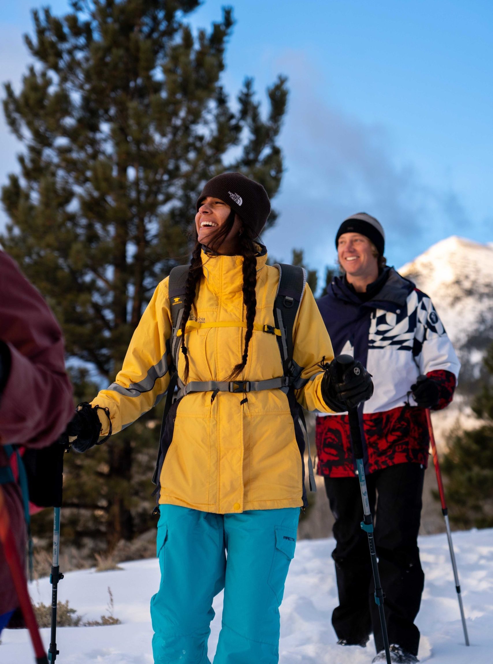
- Focus the values on the bigger picture, winter lifestyle
LUVLines is Southwest's monthly internal publication distributed to communicate company-wide news, highlight accomplishments, and share event photos and encouraging stories. LUVLines reaches over 50,000 employees. I designed spreads for the June, July, and August articles.
Phase 3: Visual Branding
- Complete rebrand starting with logo through brand typography, fonts, and colors. Modernize the appearance of the brand and bring the core values to life.
- Build Brand Guidelines to create parameters for employees and a framework of consistency.
- Redesign the hangtag as a universal brand element. Update the product line, starting with SKUs for the upcoming season and then transitioning to the SKUs that sell most in the outdoor retail sector.
LUVLines is Southwest's monthly internal publication distributed to communicate company-wide news, highlight accomplishments, and share event photos and encouraging stories. LUVLines reaches over 50,000 employees. I designed spreads for the June, July, and August articles.
PROJECT KICKOFF & PHASE 1
During the 6 month process, I presented and discussed each phase of the rebrand with a core stakeholder group. The core stakeholder included the Creative Marketing Team, the Director of Marketing, the Director of Product Development, the National Sales Manager for the Outdoor Retail Channel, and the CEO.
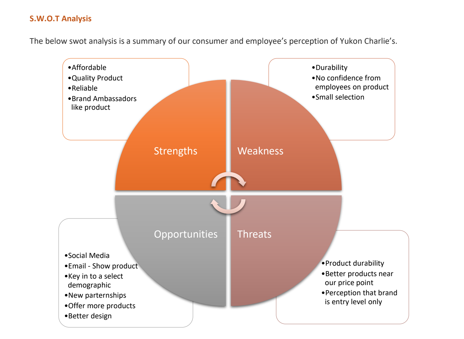
SWOT Analysis from Discovery and Research Survey
Competitve Statements that echo "high-quality at a reasonable price"
PHASE 2: WRITE AND DEVELOP
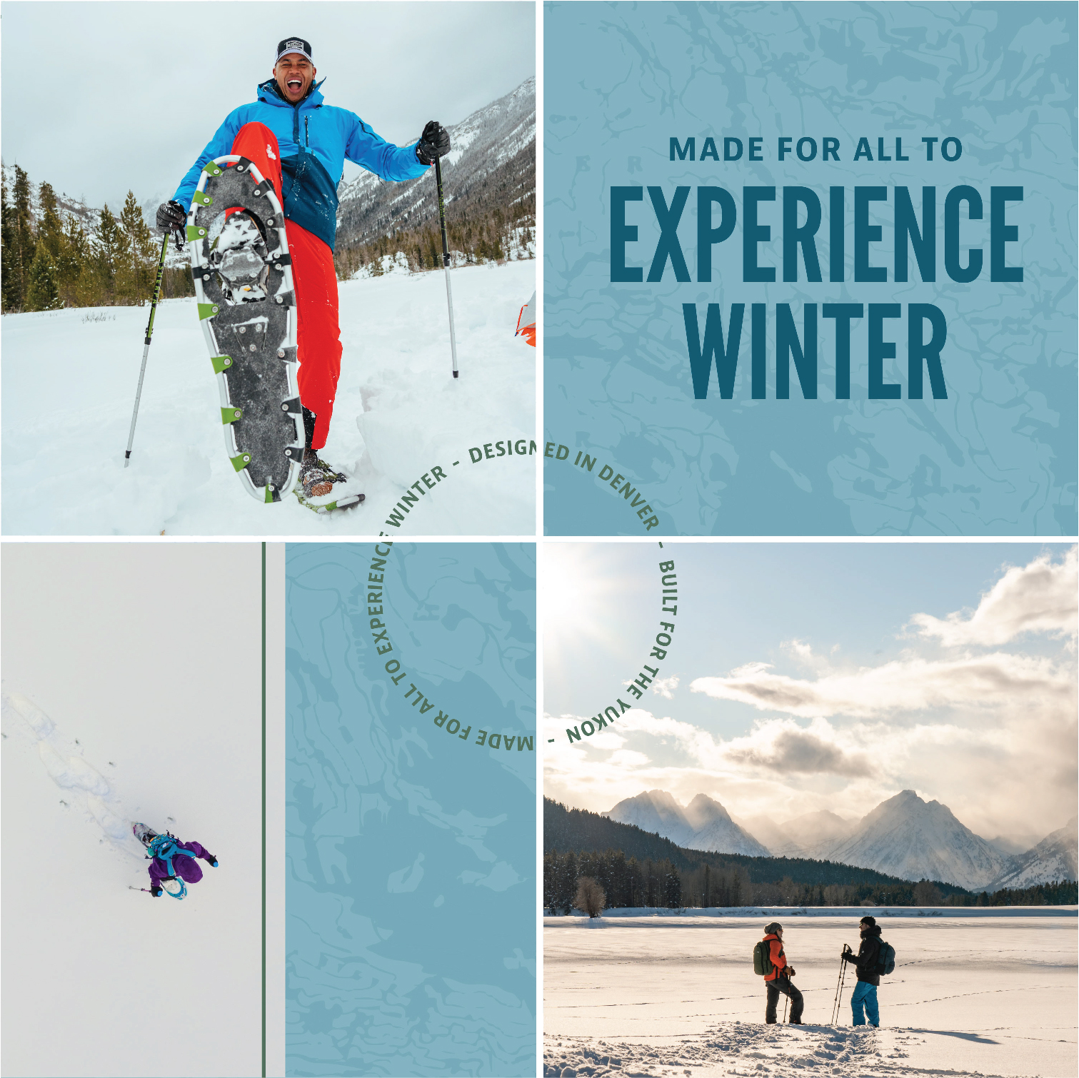
The core values represent who we've been, who we are now, and are especially who we want to be. A big emphasis was on bringing a young, diverse life to the snowshoeing industry. Our slogan, developed in 2019, still rang true: "Yukon Charlie's is Made for All to Experience Winter."
Lighthearted
To play, make memories, and be whimsical. We work hard and take our products seriously, but we don't take ourselves too seriously.
Iconic
To be recognized, revered, and respected by consumers, customers, and competition alike.
Family
Family is diverse; made up of all shapes, sizes, colors, ages, and preferences. Life is best enjoyed with those we love, those chosen, and those born into that we call family.
Explore
Trying something new can be intimidating, putting on a pair of snowshoes shouldn't be. From the backyard to the backcountry, we're with you every step of the way.
PHASE 3: VISUAL BRANDING
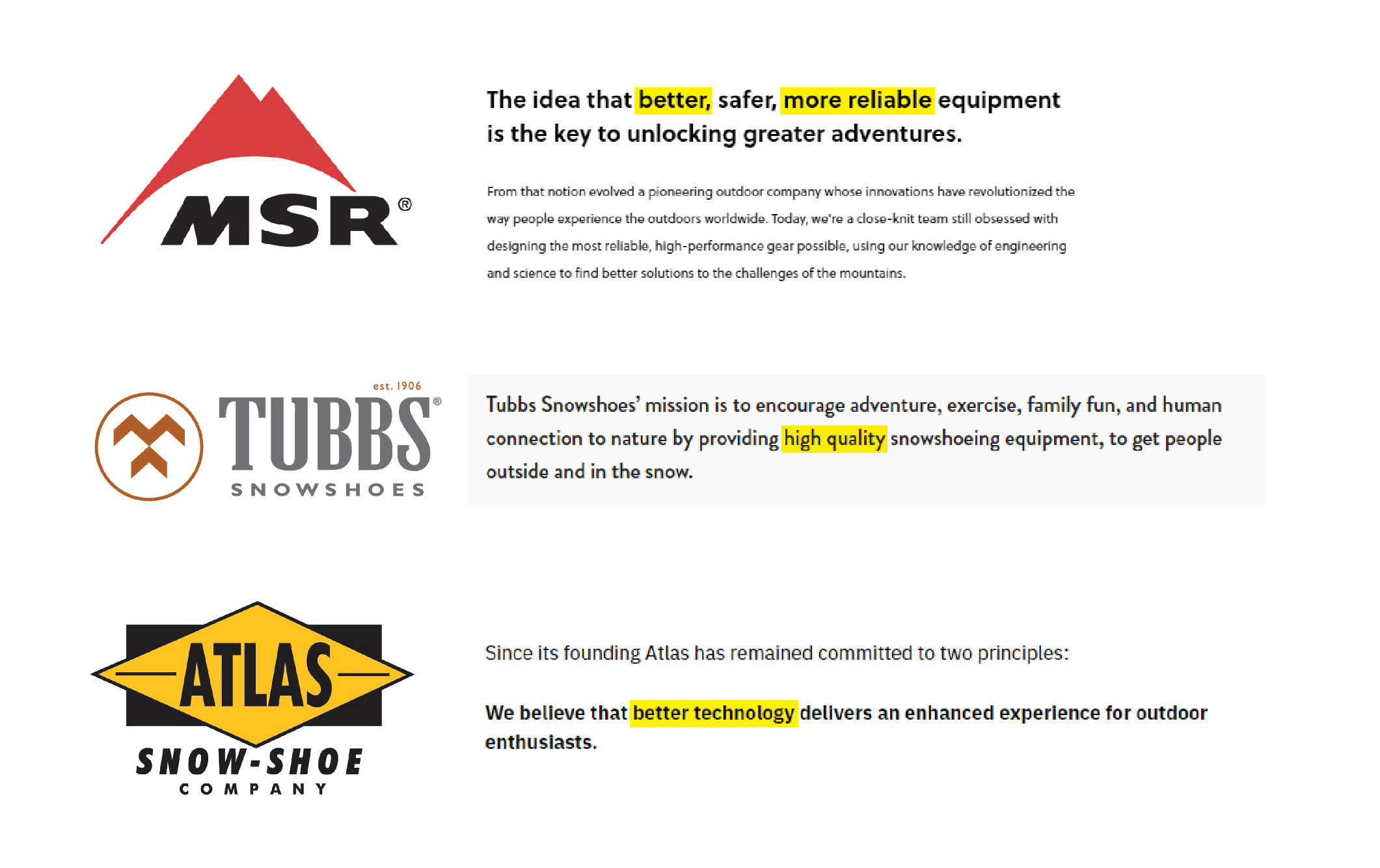
The visual branding process was kicked off with mood boards developed to represent the core values and serve as a conceptual guide. We also looked at competitor logos; one of the largest takeaways was to stay away from any visual reference to mountains as it was overused.
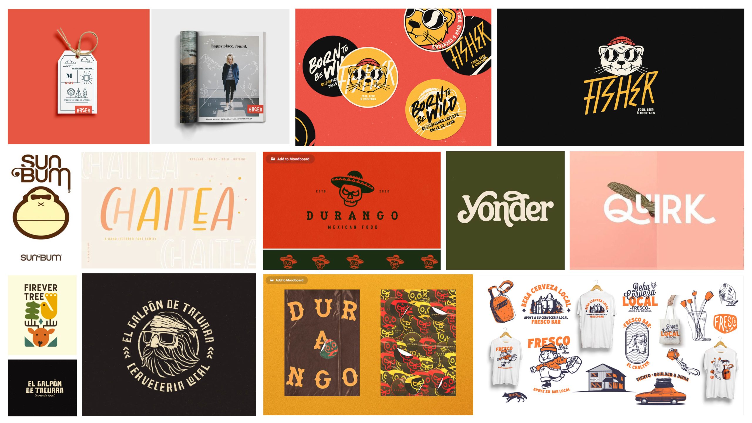
Lighthearted Moodboard
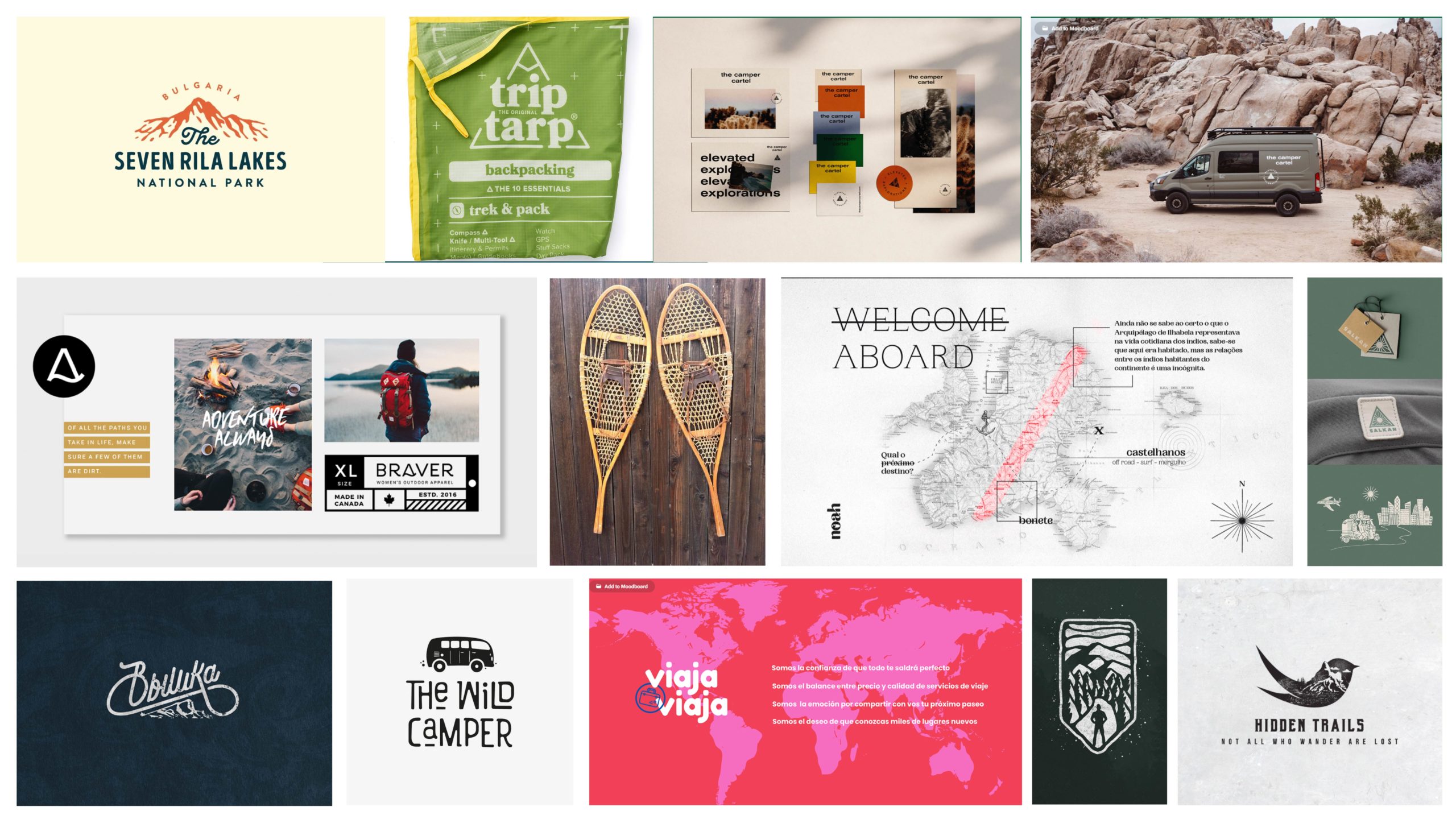
Explore Moodboard
Competitve Analysis: Competitors Logos
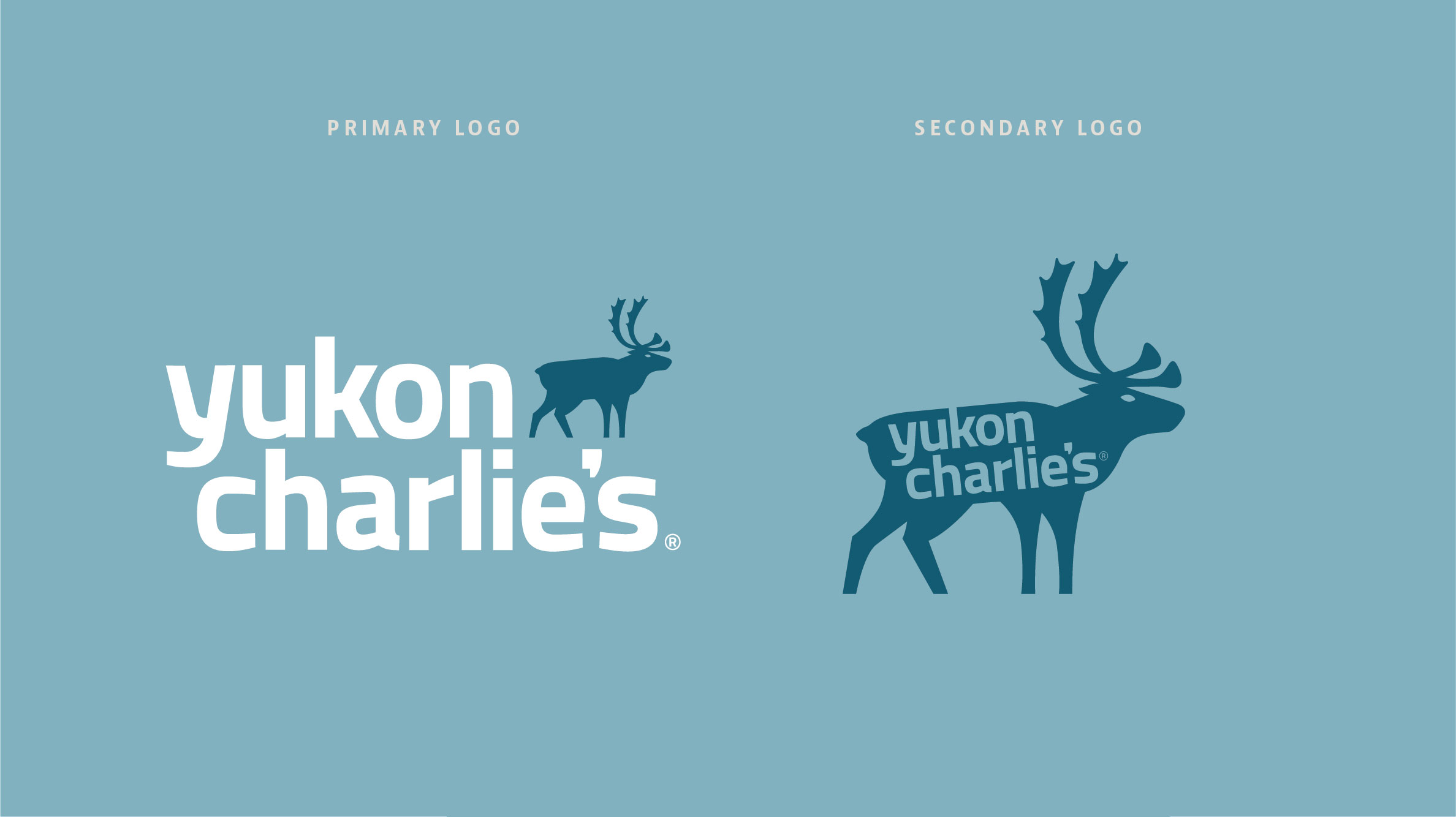
The first round of logo variations. I highlighted the key qualities and refrenced which images from the moodboard were most prevelant in the wordmark.
The original brand mascot of Charlie the moonshiner, seen in the 2016 logos, did not fit the "Family" core value. If we were to introduce a new mascot it needed to be the perfect fit. A caribou was just that: Caribou stay in herds (Family) and travel the furthest distances of all North American land animals (Explore), their hooves are also compared to snowshoes in functionality.
Conceptual poster, highlighting typography and brand message as a standalone element
BRAND GUIDELINES
Creating consistency from here on out.
The brand just gets started once the visual elements are defined. Making brand guidelines was crucial to the success of building consistency and implementing the new visual direction. This especially rang true after the years of inconsistency.
The brand guidelines set the stage and created a set of building blocks for a new catalog, tradeshow booths, packaging, email template, and more.
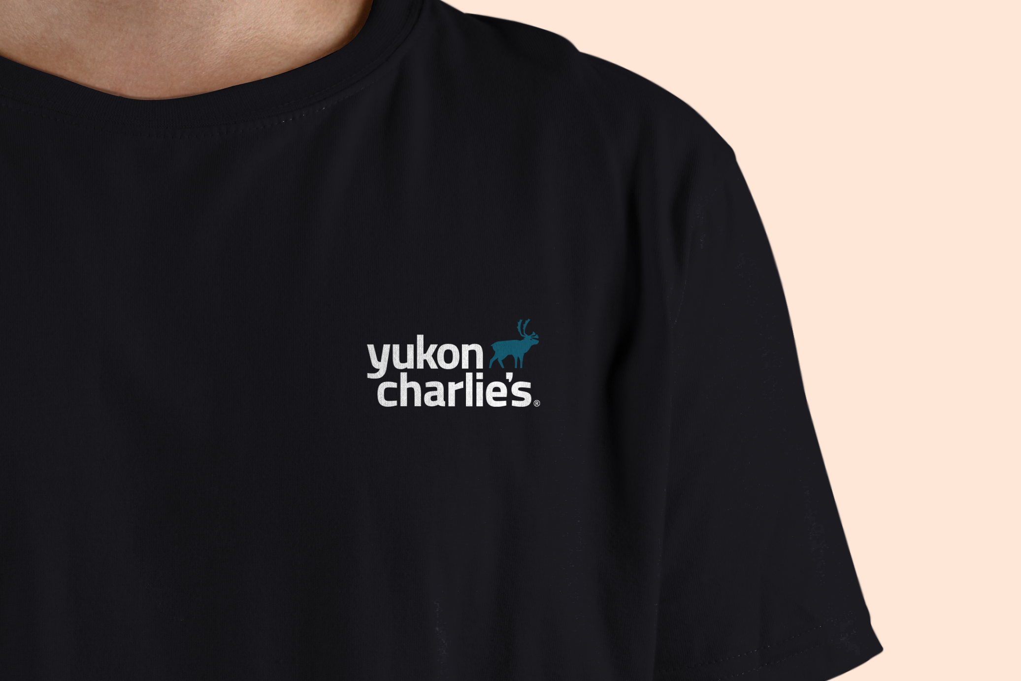
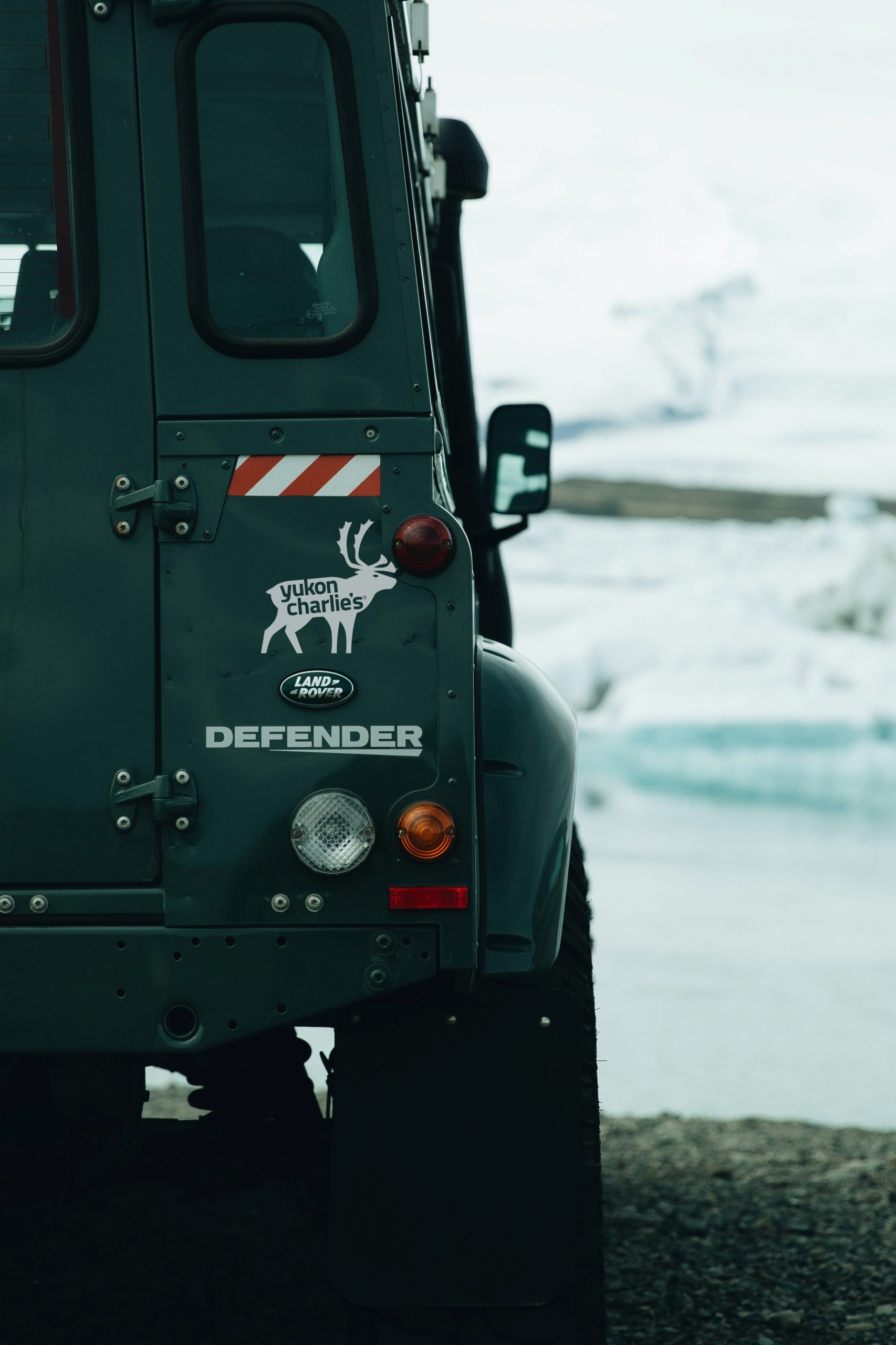
BRAND LAUNCH
Unveiling the new brand.
On December 15, 2021, we officially launched the new branding across our social channels. Our focus remained on the language and conveying our intentions in our defined values and the visual updates were just the cherry on top.
Creative direction by Kendal Krol, Jon Bausman, & Krista Huffman. Video by Digital Peak Productions.
Other Projects
Product DesignProduct Design
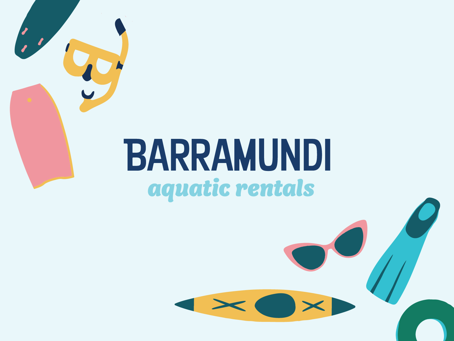
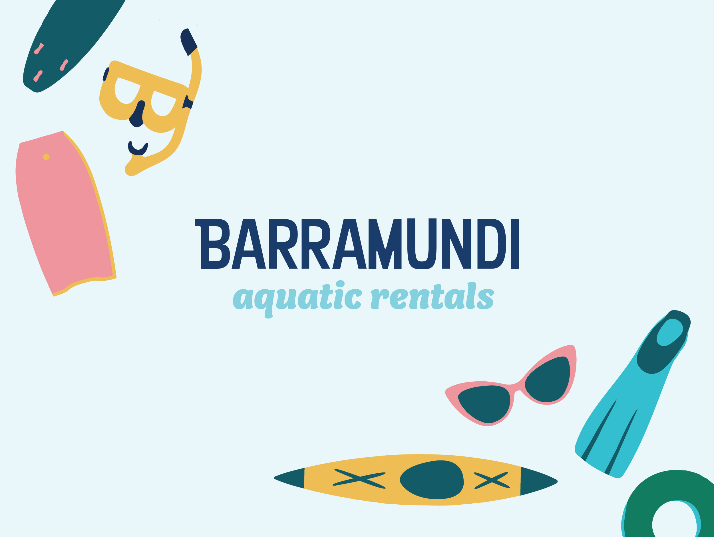
BarramundiBranding, Illustration
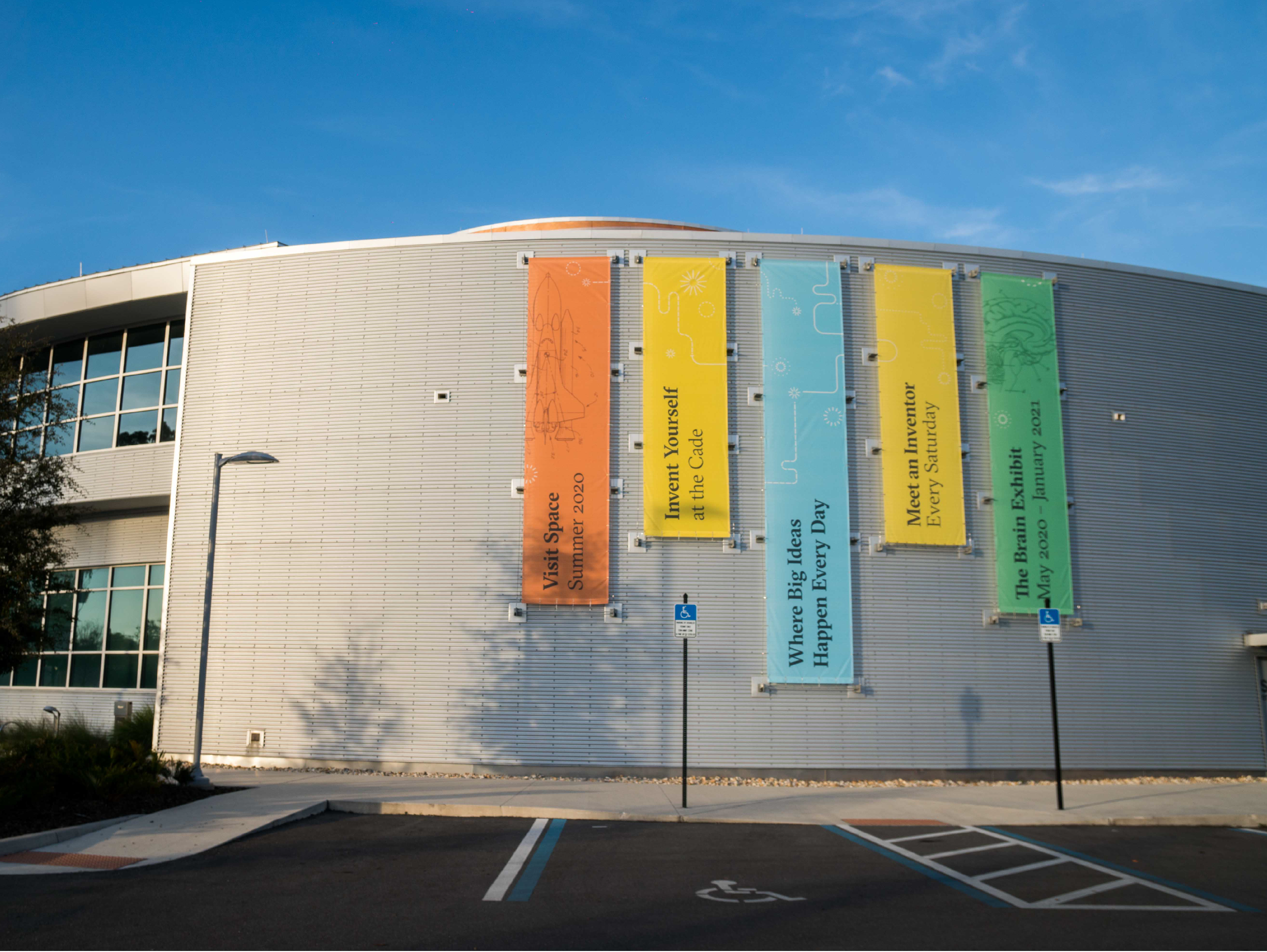
Cade MuseumIn House Design
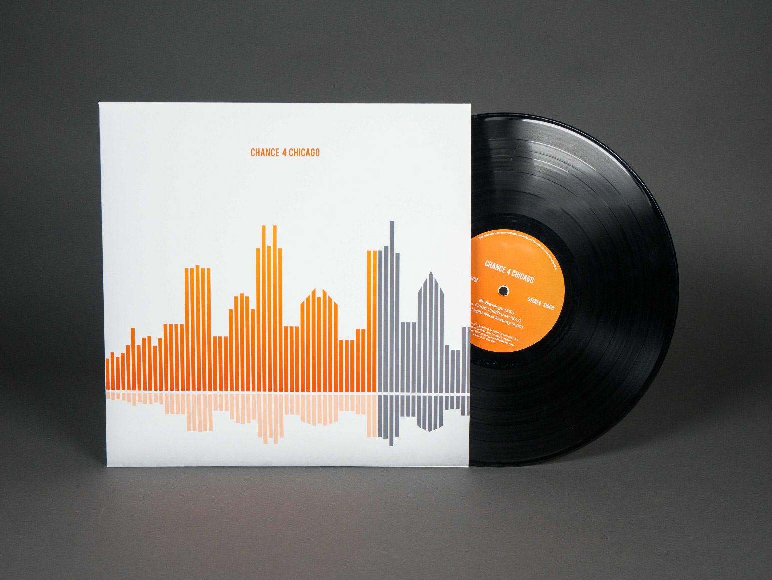
Chance for ChicagoCampaign, Branding
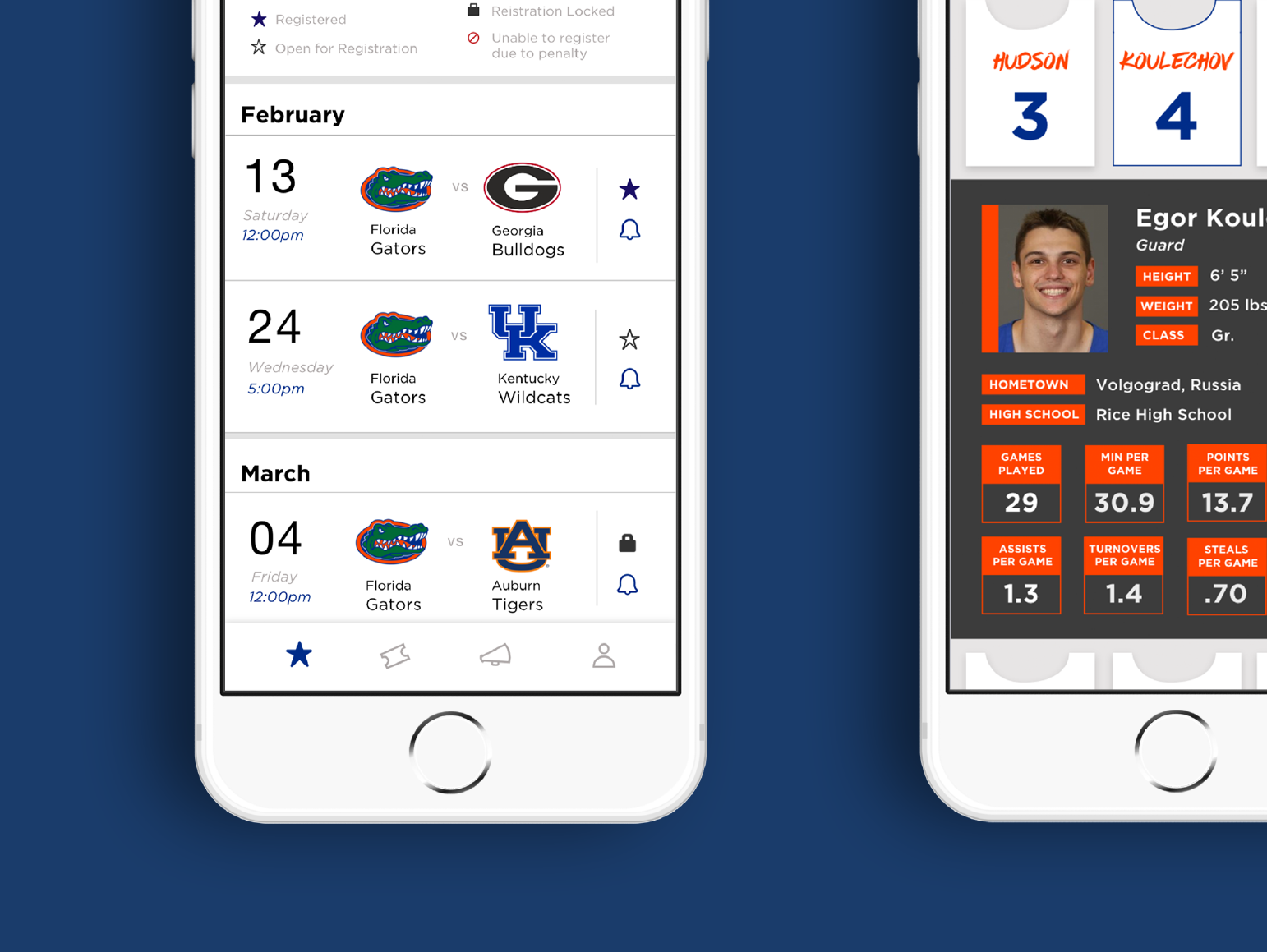
Men's Basketball AppUI / UX
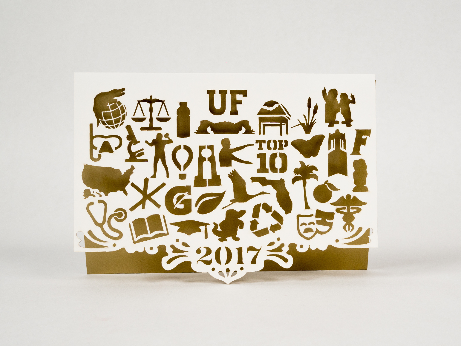
Holiday CardGraphic Design, Laser-Cutting
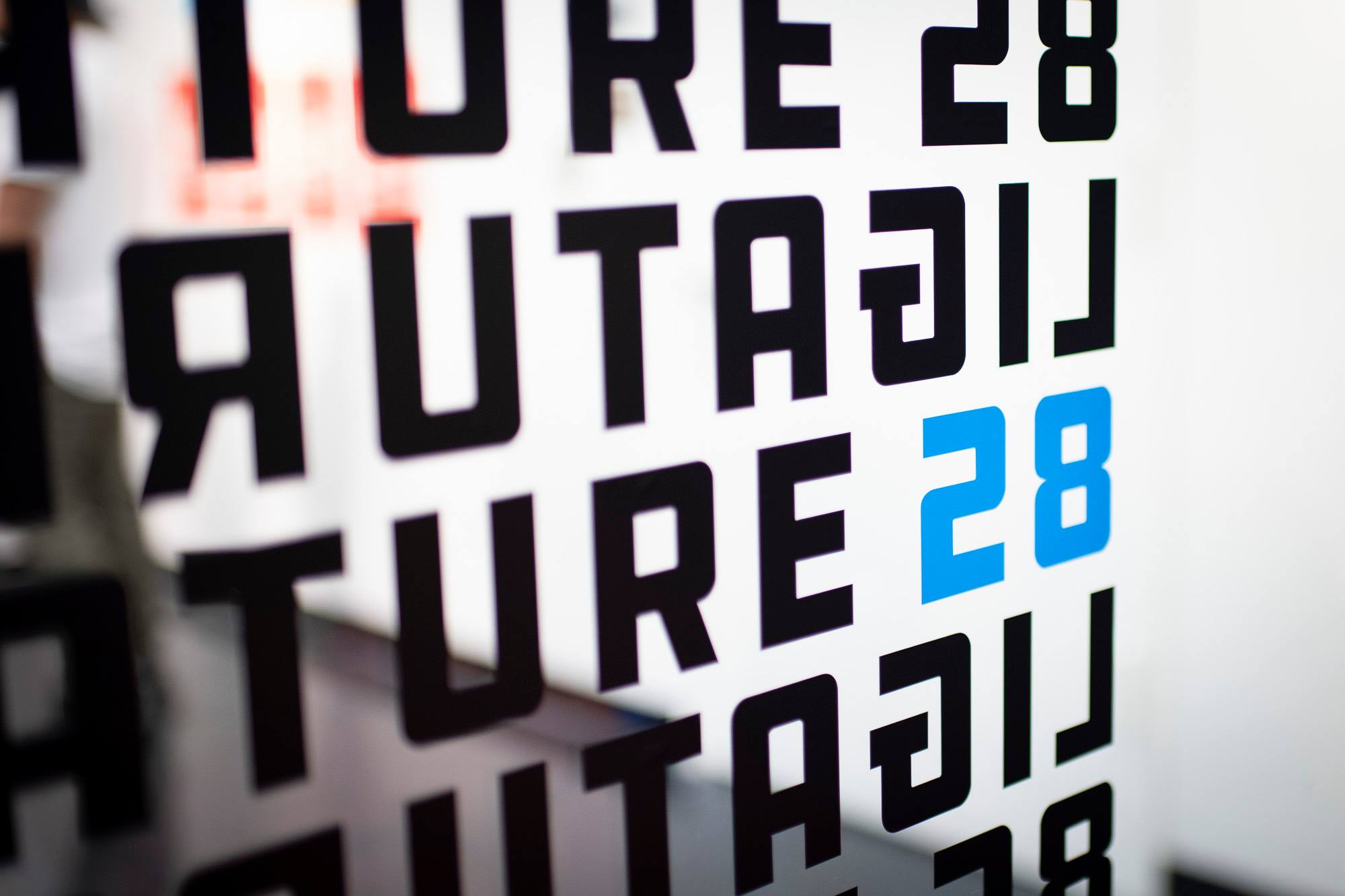
Ligature 28Project Management
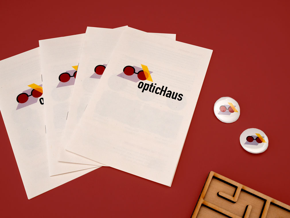
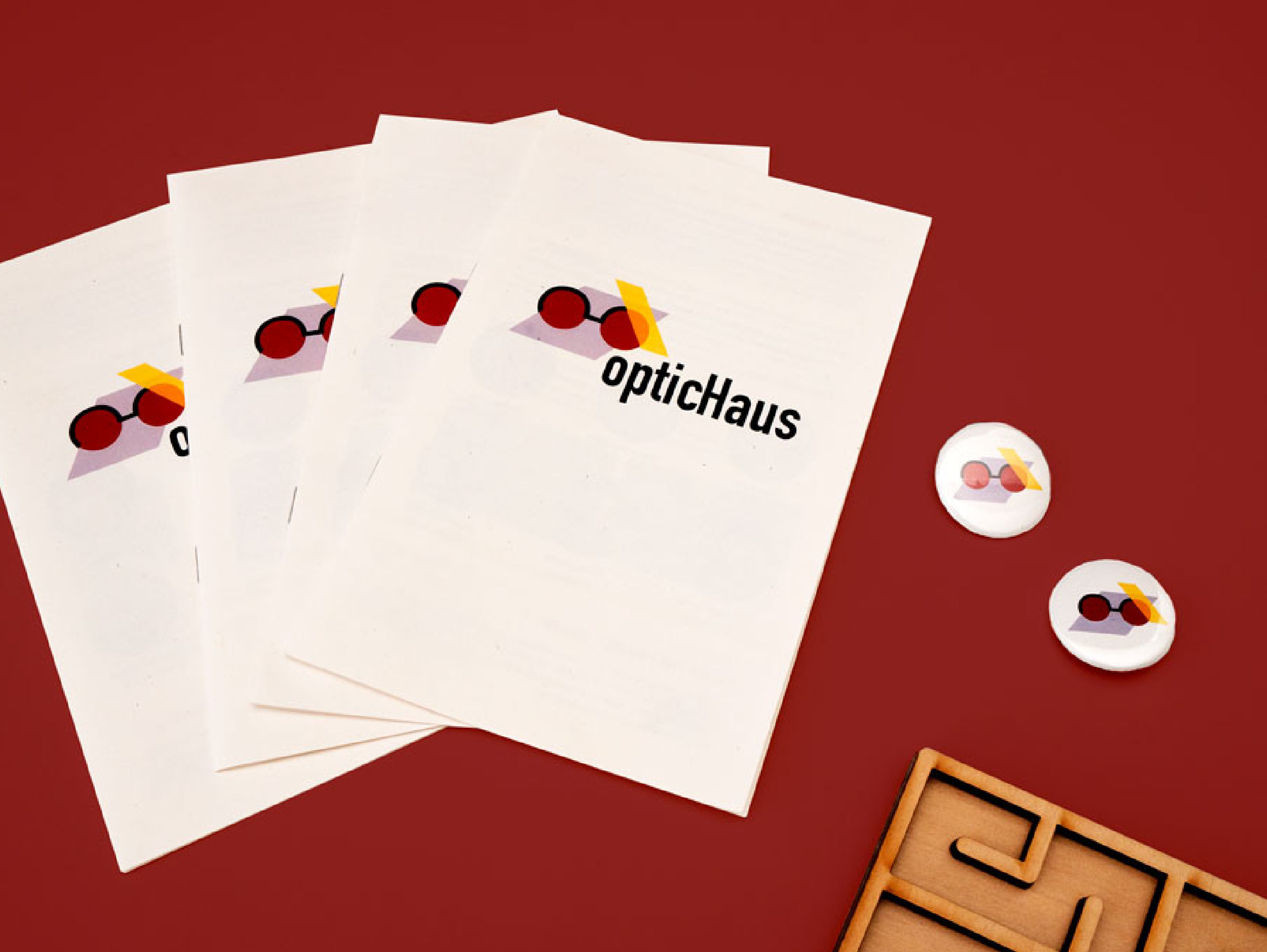
OpticHausBranding, Virtual Reality
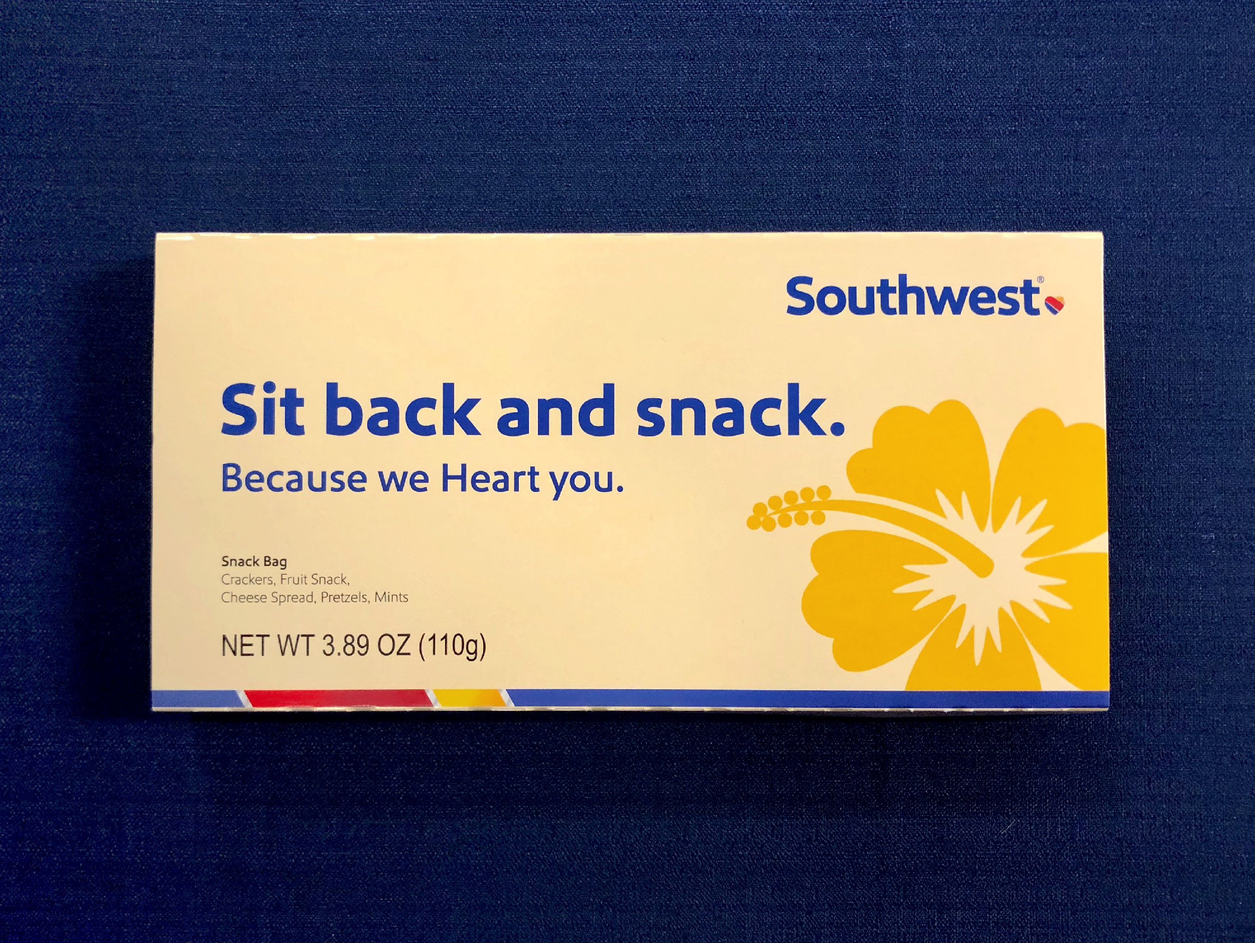
Southwest AirlinesInternship, Corporate
Brand PhotographyPhotography
Say Hello: kendalkrol@gmail.com
kendal.jones4@gmail.com
kendal.jones4@gmail.com


Featured Projects in Header
All Projects & Work